
Shared commerce patterns had to scale across four brands without flattening each brand's visual identity.
Back to projects
Additional work / Commerce and design systems
A shipped commerce system that keeps four brands distinct on shared product foundations.
Production work across Blue Nile, James Allen, Jared, and KAY, spanning shared components, responsive rules, product configuration, discovery, and account utility.

Overview
One system, four brands: production-ready behavior where identity, utility, and buying intent meet.
Customers browsing high-consideration jewelry, comparing product detail, narrowing options, and managing account actions.
Product design, component patterns, responsive behavior, interaction design, and visual direction.
A shipped foundation for components, responsive behavior, and interaction patterns with room for brand-specific expression.
Challenge
Consistency had to scale without making four brands feel interchangeable.
The brands share many commerce tasks: navigation, product inspection, personalization, filtering, account actions, and purchase decisions. Their expression still needs different imagery, typography, spacing, and content rhythm.
I focused on reusable component boundaries, tokens, responsive behaviors, and interaction patterns, then used brand-specific composition and art direction where identity needed to remain distinct.
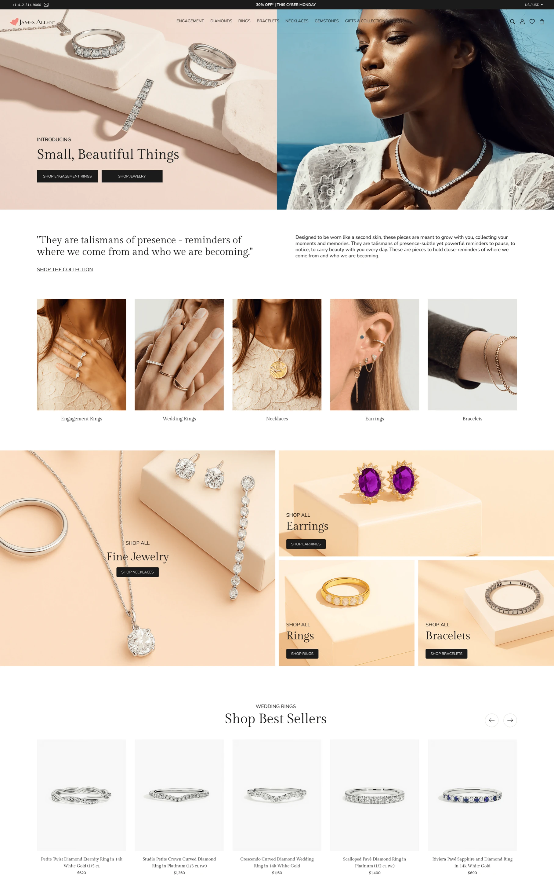
A homepage composition built on shared commerce foundations.
Navigation, product entry points, content modules, and responsive behavior remain reusable while imagery, typography, and editorial rhythm carry the James Allen expression.
Flow in motion
Shared behaviors across navigation, configuration, product inspection, and responsive states.
Homepage storytelling
Open with a clear brand mood before asking shoppers to choose.
The homepage flow connects editorial imagery, category entry points, and product confidence without turning the page into a campaign-only surface.
Process
A shared system translated into brand-specific, production-ready behavior.
Foundation
Aligned shared components, tokens, states, and interaction patterns across the commerce experience.
Responsive
Defined how navigation, content density, imagery, and actions change across breakpoints.
Surfaces
Applied the system to gallery, detail, personalization, configuration, account, and discovery workflows.
Expression
Used composition, imagery, type, and spacing to keep each brand recognizable on top of shared foundations.
Delivery
Defined states, breakpoint behavior, and implementation details, then partnered with product and engineering through design QA.
Shared component contracts
Defined reusable structure, states, and interaction behavior so implementation remained consistent across brands.
Brand expression through tokens
Kept imagery, typography, spacing, and editorial composition flexible so shared patterns did not erase identity.
Responsive implementation rules
Treated breakpoint changes as defined product behavior across navigation, galleries, configuration, account, and discovery.
Final experience
Selected surfaces showing how shared behavior supports distinct commerce experiences.
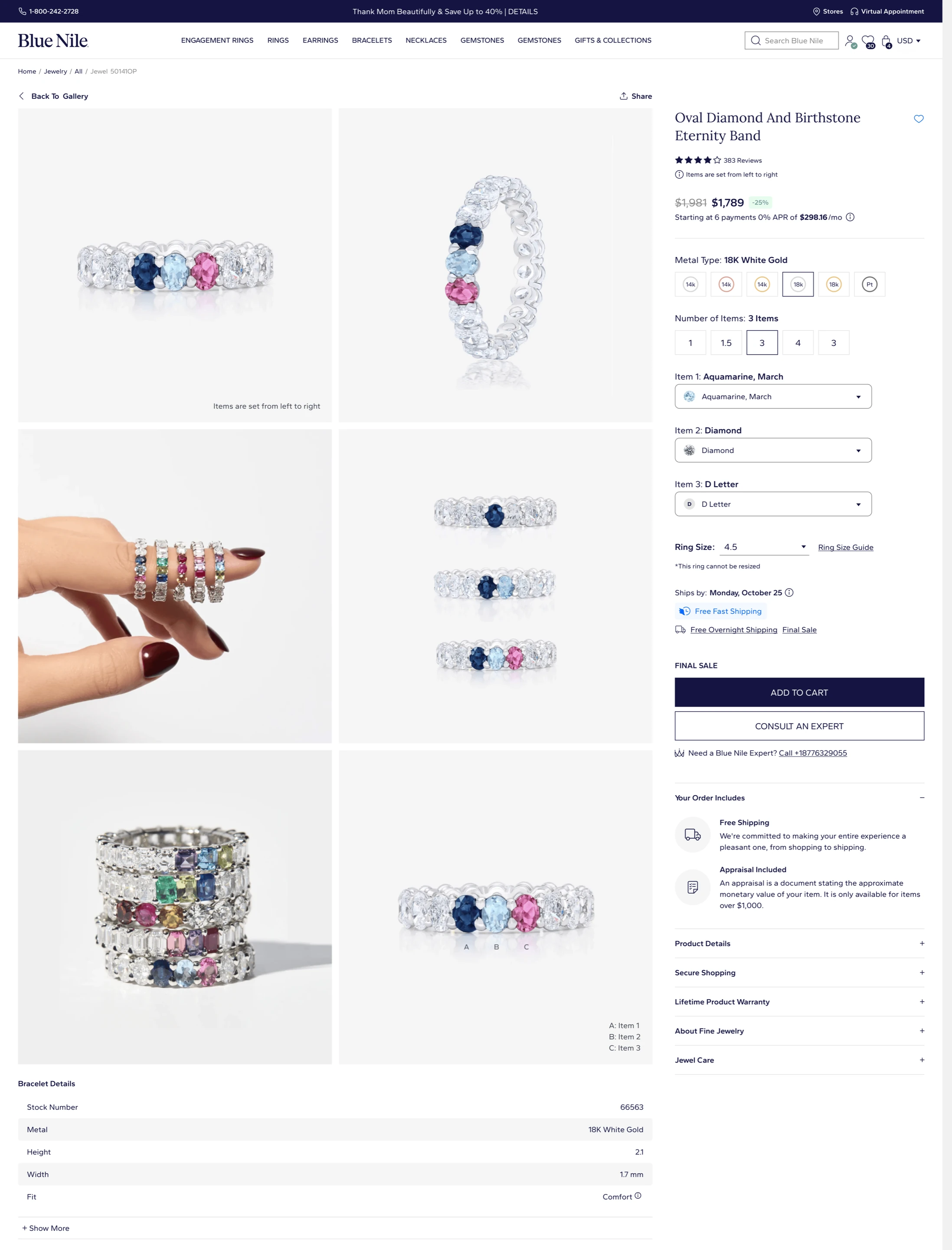
01 / Item page
Make personalization feel considered, not configured.
The item page balances product imagery, selection controls, trust details, and purchase hierarchy without letting the interface overpower the jewelry.
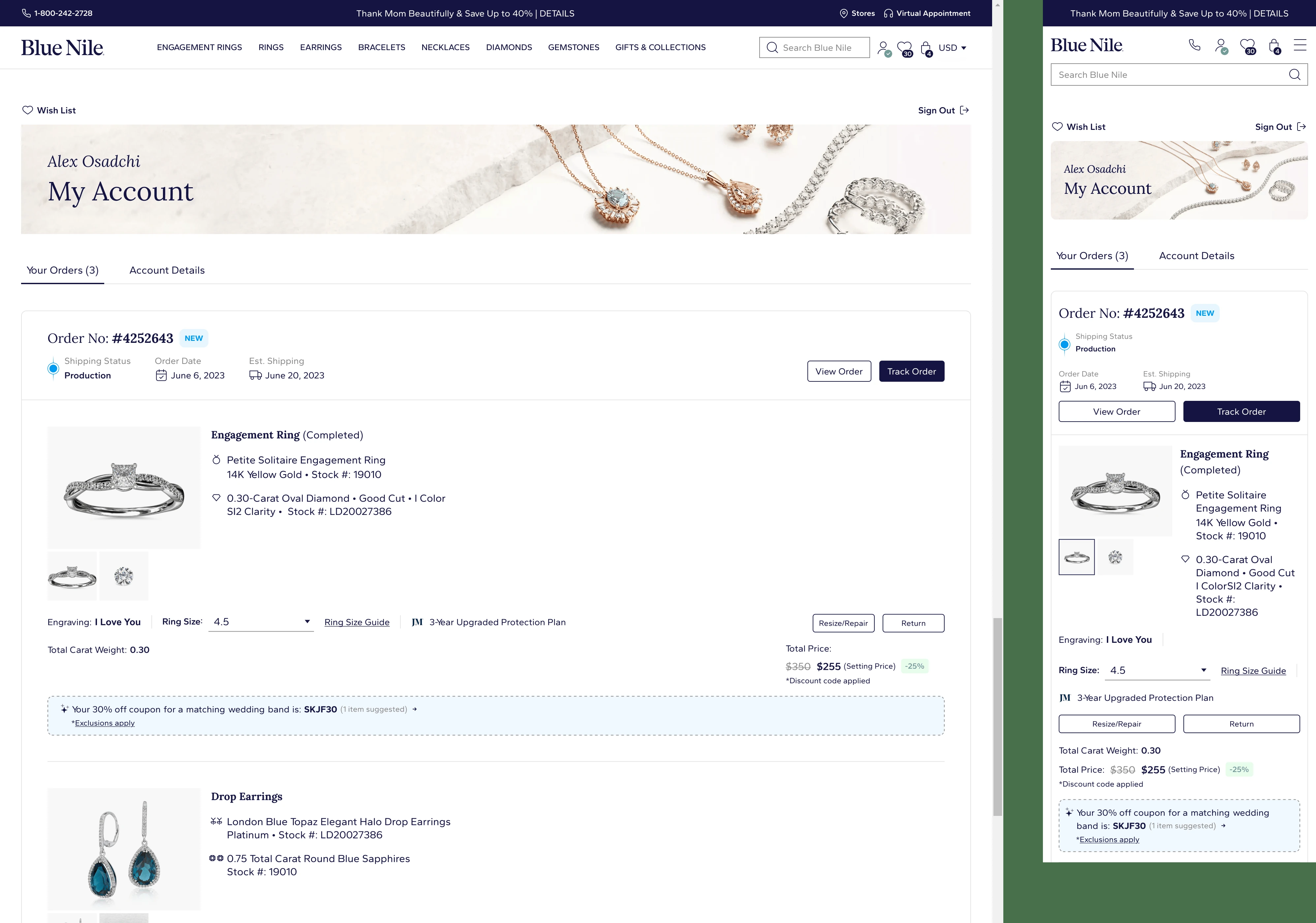
02 / My Account
Carry the brand into the practical parts of ownership.
Account navigation, order information, saved items, and profile states are organized as a quiet service surface instead of a generic backend screen.
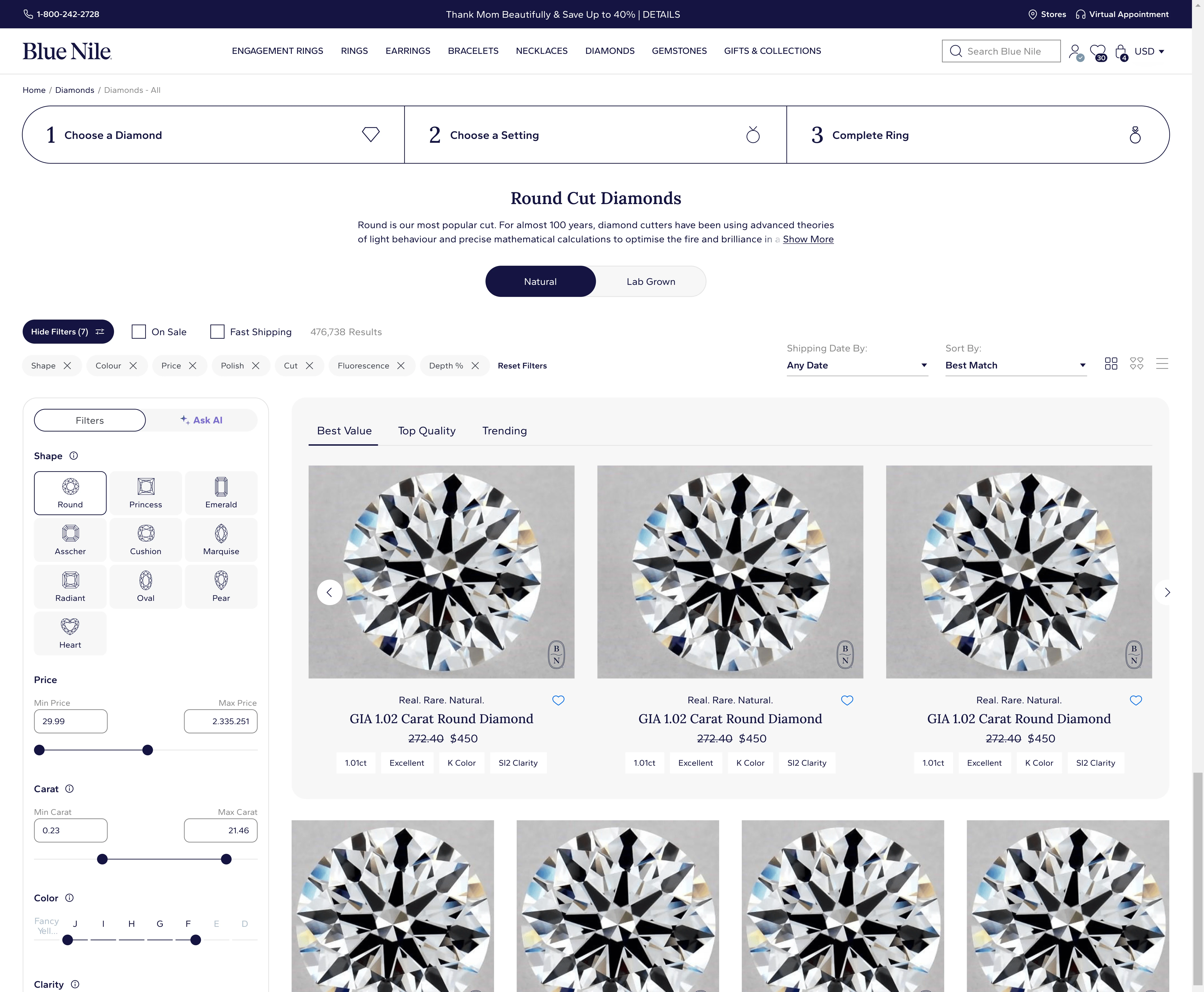
03 / Guided discovery
Make a dense selection process feel easier to act on.
The diamond discovery surface brings filters, AI assistance, result cards, and product comparison into one structured flow so shoppers can narrow options with less friction.
04 / Responsive detail
Keep personalization coherent across desktop and mobile.
The personalized jewel flow keeps product media, option controls, pricing, and purchase actions aligned across a wide detail page and a compact mobile view.

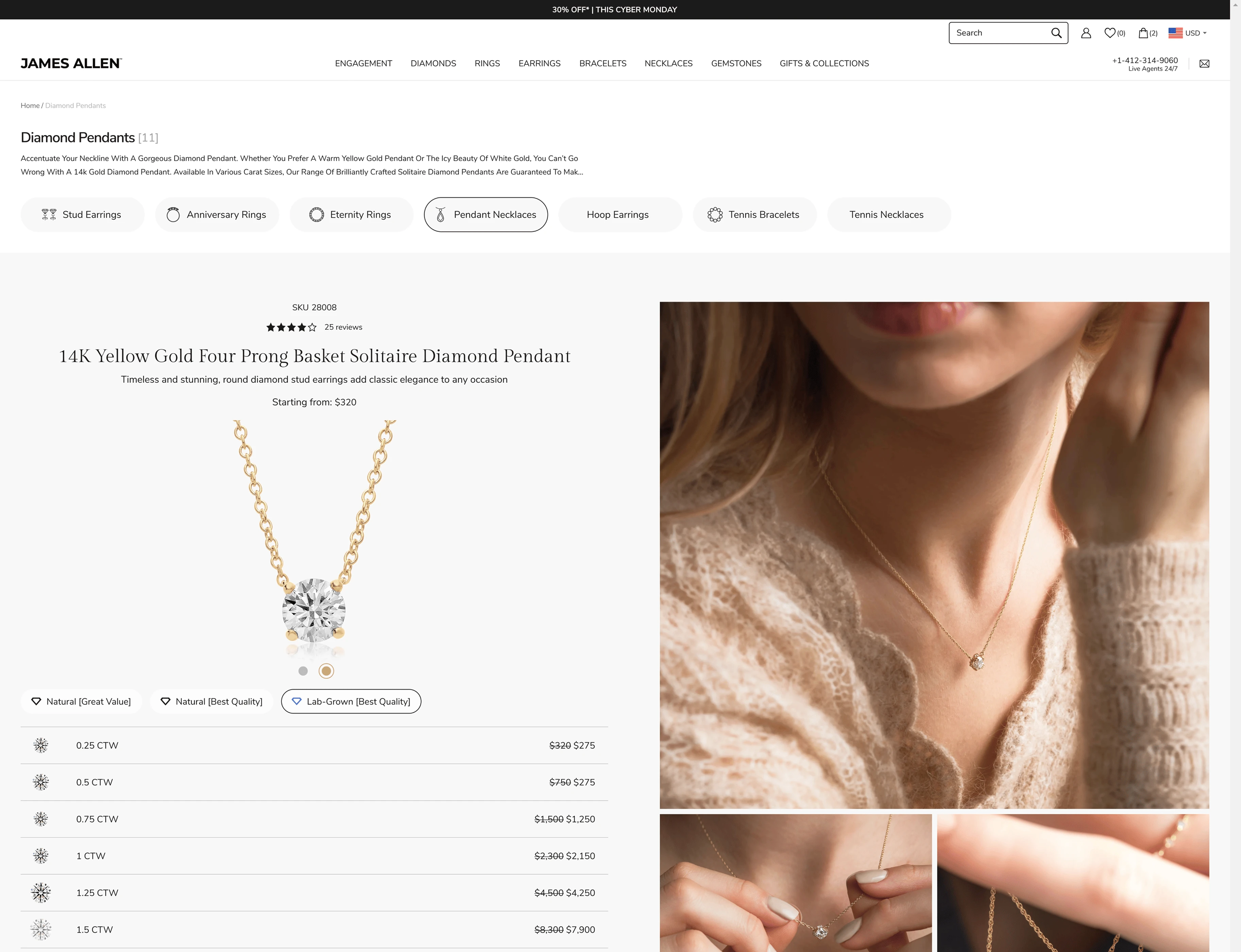
05 / Gallery system
Use editorial scale without losing shopping structure.
The gallery direction balances large lifestyle imagery, product configuration, pricing, and category navigation so the page can feel premium while still supporting comparison and conversion.
Evidence of scale
A shared system proven through adoption across four retail brands.
Scale is demonstrated through shipped breadth, reuse, and consistency across the portfolio.
The system supports production experiences across Blue Nile, James Allen, Jared, and KAY, from homepage moments to product, configuration, account, and discovery workflows.
Shared component contracts, states, and responsive rules reduced duplicated design and implementation work across recurring commerce patterns.
Imagery, typography, spacing, and composition remained flexible, allowing each brand to preserve recognition and editorial range on top of shared foundations.
Design, product, and engineering could extend known patterns with clearer handoffs and fewer one-off decisions while keeping brand-specific expression intact.
System impact
A shipped commerce foundation that scales without erasing brand identity.
Shipped shared components, tokens, responsive behaviors, and interaction patterns across four retail brands.
Applied the system in production from expressive homepage moments into product, configuration, account, and discovery workflows.
Kept brand-specific composition and art direction flexible on top of reusable product foundations.